You know that feeling when you learn a new word or phrase, then suddenly you notice it everywhere?*
That happened to me in a big way recently and it changed the way I do content design forever.
The backstory
I was listening to the excellent If Books Could Kill podcast — specifically the episode where they slow-roast the book Clash of Civilizations.
Cohost and ex-lawyer Peter Shamshiri accused the author of doing something called ‘distinction without a difference’.
Here’s the transcript:
Peter: There’s an idea in the law called distinctions without a difference, right?
Michael: Right.
Peter: When someone is trying to differentiate between two things, they start grabbing onto any distinction they can even if they’re not meaningful distinctions. That’s what he’s doing here.
I wasn’t sure why, but this exchange resonated with me. I needed to look into this ‘distinction without a difference’ thing more.
So I did some idle Googling, and — sure enough — it’s a thing! A real logical fallacy, with a Wikipedia entry and everything!
From there, more examples of distinction without a difference poured forth like water:
- Claiming you didn’t lie, you just told a half-truth or omitted information
- A company justifying their offshoring of revenue to a tax haven as “tax optimisation”
- A shameless gossiper reframing their favourite pastime as Sapiens-style evolutionary information sharing (this is me I do this whoops)
It was somewhere between “calling the long way the scenic route” and “not being mad, just disappointed” that I realised the real reason why this fallacy lit my brain up like a Christmas tree.
It’s a core problem we deal with in content design. All. The. Time!
How it crops up in content design
As content designers working on software products, we’re constantly, constantly being asked to leverage language to explain two or more very similar things in the same interface.
And despite our best efforts, the end result is often distinction without a difference from a user’s perspective.
Think of every time you see both an Account and a Profile button right next to each other in the corner of an interface, and you have a split-second moment of confusion about which does what. That’s distinction without a difference.
Another example is this menu screenshot:
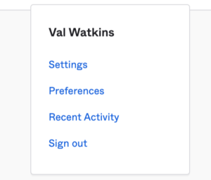
Putting both Settings and Preferences in the same list, right on top of each other? Distinction without a difference.
And this screenshot from a credit card application form:
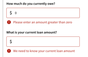
What’s actually the difference between these two questions? Read them too quickly and there isn’t one. Read them too slowly and there isn’t one. Dual-speed distinction without a difference, you love to see it.
Last one. This example is my personal favourite, a destructive dialog from everyone’s favourite software product, Microsoft Excel:
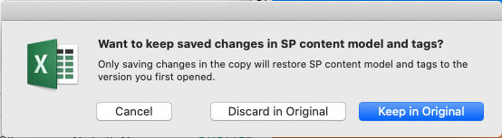
What does each button do, exactly? You can kind of figure it out, but also, can you really? Are you 100% confident in what clicking each button will do? No?
Distinction without a difference, baby.
You gotta keep ‘em separated
OK so distinction without a difference is pretty common in content design. How do we get around it?
I see two ways to tackle it:
1. The nuclear option
The best way to overcome distinction without a difference is also the most drastic: remove one of the items completely from the specific interface.
In the settings menu, whatever is behind Preferences could likely be behind Settings. There’s no reason they deserve separate entry points (probably).
In the credit card application, those two similarly-worded questions do not need to appear sequentially. They could be separated by a ‘Next’ button.
And that Excel dialog… actually I have no idea how to fix that one with a UI change. Stick with Google Sheets? 🤷♂️
2. The ‘relax, content design will fix it’ option
If you can’t change the UI, there are also ways to solve it through language. But it’s not elegant.
The best method I know is to have each string worded as differently as possible.
Start one with a verb, start the other one with a noun. Make one a question and one an instruction. Add icons, change colours. Do whatever you need to do to make them stick out from each other. The old adage was right, variety really is the spice of life.
Going back to the credit card application, having the questions read in this way, with the hierarchy flipped, might help:
- Enter your original loan amount:
- How much do you have left to pay?
It’s not breathtakingly beautiful content design — it breaks the pattern and rhythm-setting parts of our craft — but it gets the job done. Similarities, begone!
The art of telling things apart
So now you too have the power to spot distinction without a difference in your interfaces. Use it wisely, my friends.
The blessing of knowing about this fallacy is, once you can spot it in the wild and call it out in realtime, your colleagues won’t be able to un-see it either.
So, if nothing else, you now have a compelling new thing to say at design critiques that make you sound like an absolute word wizard (you’re welcome).
But it may be more of a curse than a blessing.
I now find myself saying “that’s in danger of being distinction without a difference” more times a week than I’m comfortable with. Am I being insightful, or just annoying? Am I distinction-splaining? Uh oh.
Oh well! I still think it’s a worthy cause for content design to take arms against.
Let’s vanquish this many-headed hydra from our UIs. And if they can’t be vanquished, glow them up so they stand out and shine bright, living their best lives.
Such a mission requires a rousing motto. I have one from the great philosophers of our time, 2000s-era UK dance music group Groove Armada: “if everybody looked the same, we’d get tired of looking at each other”.
*It’s called the Baader-Meinhof phenomenon, which, ironically, is terribly hard to remember. “Frequency illusion” is a MUCH better name.
Hey, I’m Val. I’m a Content Design Lead at Canva. To get the odd email from me, sign up below. Just plain text and quirky links. Minimalism FTW 💖