Sometimes when I’m laying on the couch in a state of Instagram scrolling-induced paralysis, I stumble upon a delightful surprise: commenters becoming makeshift content designers.
I’m talking about the recent-ish trend of using the comment field to “relabel” the purpose of Instagram’s 🩶 Like button.
Here’s some examples:


How good!
It’s not a Like button anymore. It’s an “AI is scary” button, a “Still trying to survive” button, and a “Respect button for the man who brought us Mr Lonely“.
People are so clever and the possibilities are limitless. It really makes me smile.
It’s much better than the last time content design had a moment in the sun.
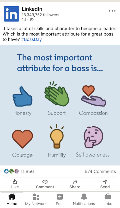
For a while, many of LinkedIn’s finest posting raconteurs repurposed the platform’s reaction buttons to be voting mechanisms.
Even LinkedIn itself got in on the action:

I can see what they’re doing. And it’s kind of nifty how they’ve changed the job-to-be-done of a reaction button to that of a voting paper (no new functionality required! The engineering teams will be happy).
But…ugh. Such an obvious engagement grab. It’s a bit ick and I’m glad the trend is mostly gone.
The Instagram versions are a billion times better and more creative.
Long may this new manifestation continue ✍️ ✍️ ✍️
Hey, I’m Val. I’m a Content Design Lead at Canva. To get the odd email from me, sign up below. Just plain text and quirky links. Minimalism FTW 💖
